Job Descriptions – UX & Visual Updates
Based on user testing & UX evaluation, I identified a few areas to clarify the candidate experience within Facebook Careers website’s job descriptions. The website has an average of 2,500 open roles and job descriptions are the most visited area of the website, with over 35.5 million page views in the last 18 months.
Skills used: user experience design, interaction design, visual design, partnership with engineering, project management
The Opportunity
3 application limit per 90 days – Candidates were frequently unaware of the policy and often completed an entire application without knowing they had already reached the limit.
App/Service details – It was not immediately clear if a job was aligned to a specific app or service.
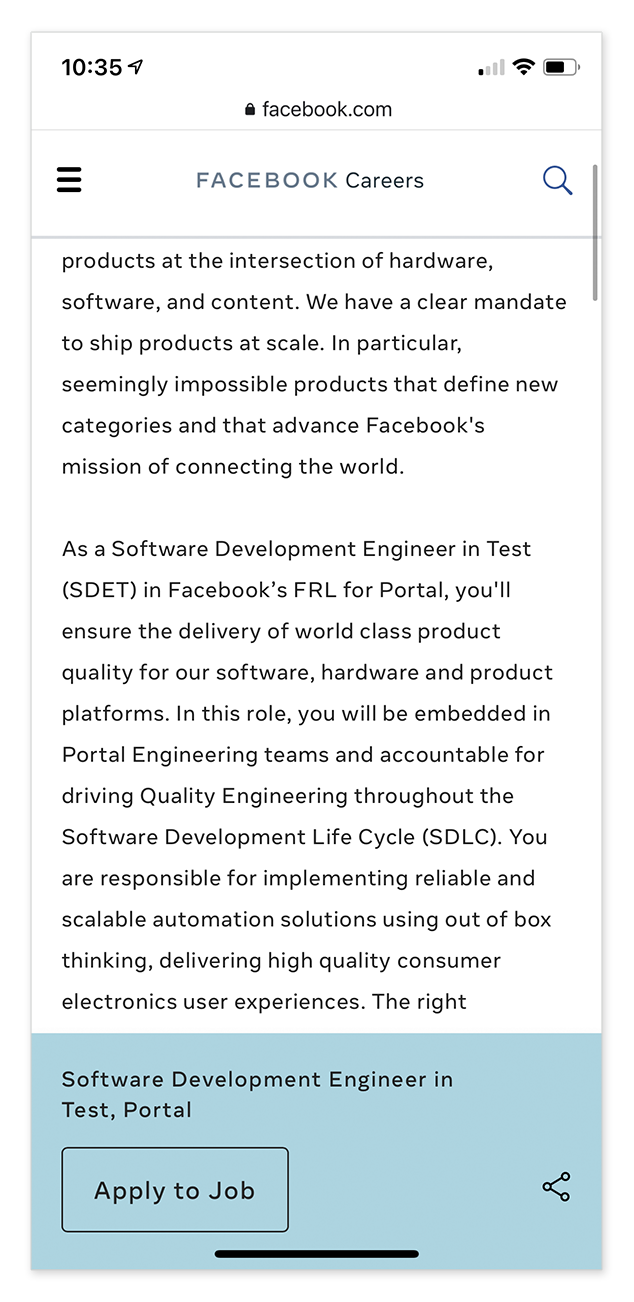
Location details – The job location was difficult to find on the page as the user scrolled down.
Visual interest – the job description lacked compelling visuals to draw the user further down the page
The UX & Visual Design Updates
Composition of the page now features a banner in a prominent, upper left location that highlights the 3 application limit. This is present on desktop. tablet, and mobile.
If a job aligns to a specific app or service, the corresponding endorsed brand logo and color palette is used on the page to visually reinforce the alignment.
Each job description will now feature an interactive map that indicates the office or data center location. If there is more than one location for a single job, the map will indicate all locations.
Content in the job description is clearly labeled, with typographic hierarchy to visually clarify the content. The job description also includes more color and interactive elements (map) to keep the user engaged.


