Site Redesign – Samsara.com
I led the user experience strategy for a redesign of Samsara’s global website.
Skills used: user experience, research, data analysis, UX writing, content strategy
The Challenge
There were a few challenges with Samsara’s digital presence on the web:
Branding: the website did not accurately reflect a premium brand, we needed to design for impact and elegance, and elevate our visuals to match the premium products we offer customers
Messaging: the site needed to tell a clear, differentiated, and benefit-driven story
Engagement:
User engagement across the site was very low, with most users viewing the home page and the pricing form before quickly exiting
Visits to product and solution pages were very low
Time spent on most pages was also very low
User journeys: users were not following any meaningful journeys on the site, and we did not have a strategy in place to encourage specific journeys
Information architecture and navigation: page titles and headline content did not clearly communicate what page the user was on or where they were located in the site structure; once the user was on a given page, they had limited ways to navigate to other related pages
Conversions: our hypothesis was that we would see increased conversions if engagement went up


Discovery
To ensure that the team had a clear understanding of user behavior and motivations, I completed the following:
Individual page analysis, reviewing heat maps, hover and scroll rates, and click rates on the top 10 most visited pages + others project scope
Review feedback from user surveys deployed on the site for 6+ months
UX audit of commonly used modules & components
I also gathered inspiration from other B2B and B2C company websites.
Strategy
Reiterate KPIs and define how we would measure project success
Clearly define what tasks needed to be completed to ensure sucess, which included:
Customer journey creation, helping users complete tasks, in order to increase engagement and conversions
Define site and page-level content strategy, including information architecture
Content consolidation and edits to clearly communicate our unique value proposition
Incorporate more interactive & engaging media; videos, motion and micro-interactions, subtle animations and hover effects
Align visuals with design of Samsara’s products
Align with engineering on how to use their time most efficiently, which included:
Looking at how to modify existing site components
Recommending net new components needed to achieve project goals
Early UX
Based on my audit of the existing site, I created two assets used by the project team to guide our work.
Created improved UX design concepts for hero modules (top priority module)
Defined a page-level UX strategy
Research
As the Brand Creative team was working on and gathering feedback for visual design concepts, I recommended that we get external validation from users via moderated user interviews. The insights was used to guide & inform decision-making with respect to the visual concept approved by leadership. Conducting the interviews also helped the team validate design decisions prior to investing additional time and resources for rounds of edits and early engineering work.
The insights enabled the team to
Identify which designs best reflect the Samsara brand and communicate a clear value proposition
To understand visual design preferences from users that mimic our target audience
Moderated User Interviews
I was responsible for each stage of the user interviews and did the following:
wrote interview scripts
defined audience attributes for sourcing
conducted five moderated interviews
distributed research results
Page UX and User Journeys
As we finalized visual design concepts for the home page, I designed improved UX and page layouts for the other pages included in the project scope. As part of the design work, I partnered with our digital strategist to ensure we had clear user journeys across the pages, driving engagement via intentional page links. We also incorporated SEO and LLM recommendations to increase organic traffic and engagement.
I also wrote first draft content that aligned with the new page-level strategy, making sure the content flow and messaging was clear and engaging.
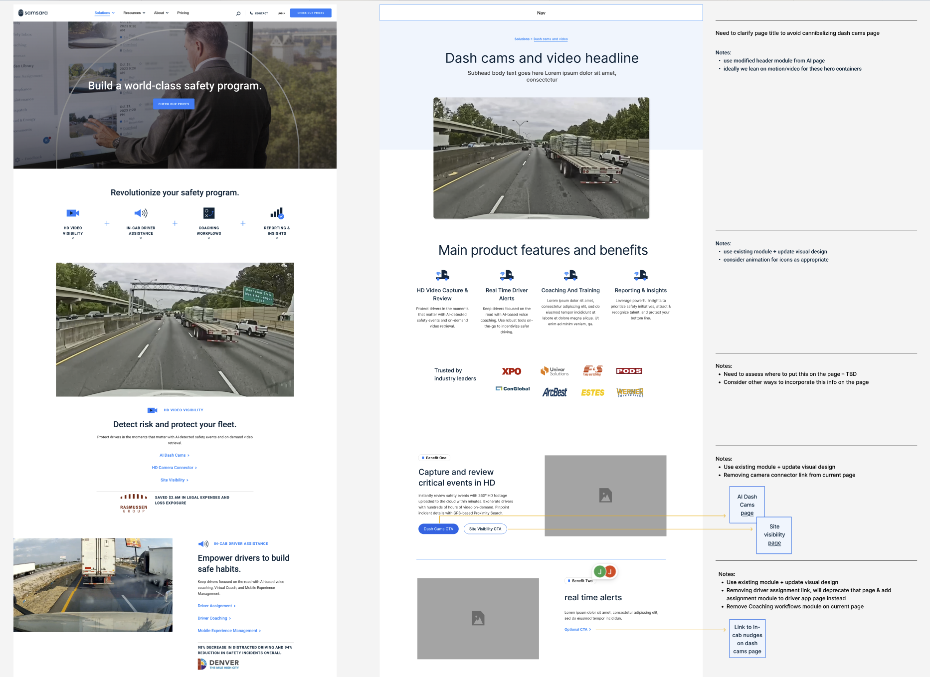
Example of current vs recommended UX design – included functionality, content and user journey notes
UX Designs – Details
Breadcrumb linking
A new feature included in the design of the site was breadcrumb link functionality. I reccommended adding a breadcrumb for a few reasons:
average page views were less than 2 per user (low site engagement)
page titles and header content did not clearly explain what page a user was on
users did not have a quick, on-page path back to a parent page or category of pages
Final Steps & Collaboration
Brand Creative
I worked closely with the Brand Creative team to finalize the home page design – consulting with the team on page structure, refining the design of net new modules, and ensuring that the new designs could scale to meet business and user needs. This included designing for edge cases and varied amounts of content.
We also partnered to ensure the new visual design language translated consistently across the existing design system – and met UX best practices.
Product Marketing and Brand Creative
As we finalized page content, I partnered with our Product Marketing & Brand Creative teams to ensure product content & visual assets aligned to page messaging & strategy.
Engineering and Content Publishing
Before engineering work began, we reviewed page designs closely to align on feasibility of the new designs, including functionality and look and feel. I also shared detailed Figma files with dev notes and functionality recommendations. As changes were made, I completed quality assurance reviews and worked with the developer & content publishing teams to ensure new modules matched expected UI and functionality.
Final Design
Site Modules
10 modules were designed for use across the site, with a focus on product and solution pages.
8 modules were designed for the home page.
Digital design system
I consulted with the Brand Creative team and provided guidance on updated web components to ensure they met UX best practices and would easily scale across the site.
Final Page Designs


The Impact
Updates went live in April 2025 and we are monitoring performance. Detailed metrics coming soon.