Prospective Customer Form – Samsara.com
I led a project focused on optimizing the prospective customer form on Samsara.com.
Skills used: strategy, surveys, wireframes, analytics, user experience, visual design
The Challenge


Disconnect between user expectations & the actual experience: The existing form did not match user expectations – users clicked a “Check Our Prices” button, were asked to provide their information, and after submitting did not receive pricing information. Users were frustrated and felt misled by the experience.


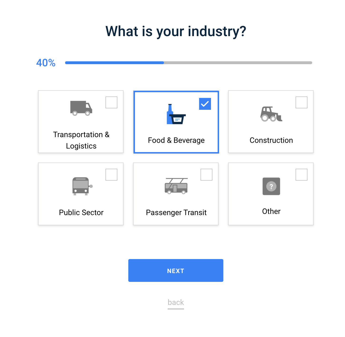
Form UX: Form fields lacked standard input validation, the visual design was clunky and dated, and there was inefficient use of space (elements like buttons and links sit below the fold for most users). The form is long (7 steps) and doesn’t provide a way for users to move between questions.
Strategy
Because the current user flow and form UX had been in place for many years, I wanted to ensure we began the project by gathering qualitative and quantitative data to assess the usability and sentiment of the form experience. Gathering this data helped our team:
Identify user concerns and pain points
Reduce bounce and exit rates
Optimize lead conversions
Understand user sentiment
Collect unbiased feedback from current website users
Prioritize work based on business strategy as well as user needs
With this information, we were able to make holistic recommendations for the entire form flow as well as tactical design updates.
The Process
Understand the Current UX
I reviewed and mapped the user flow of all 7 forms to ensure I had a clear understanding of the UX. I observed that the US form was an outlier and had a more complex flow than all other regional forms.
Review Qualitative Data
I began by reviewing form KPIs, including drop-offs, conversation rates, and time spent. We noted that the largest drop-off was when users were asked for their email address. This indicated that user expectations were not in line with the actual experience.
Launch Surveys & Review Quantitative Data
I also launched user surveys on Samsara.com at two user interaction points:
When a user takes action to exit the form
When a user completes the form and lands on the confirmation page
Review the results in the presentation below.
Design & UX
While we were sharing larger-scale recommendations to the form experience, I began to explore how we might improve the user experience of the form.
Early concepts included ideas for how to clearly delineate user paths – users were routed to two distinct experiences depending on the number of vehicles they listed on the form.
I explored two distinct experiences to test against the current UX, a shorter multi-page form and a single page form. Both forms used standard form components & functionality used on our web store to create consistency.
Mobile concepts were moved into development after rounds of feedback from stakeholders and our engineering team. We led with mobile because that was the device that most users were visiting the form on.
The Impact
Development for desktop designs is in progress. Mobile test results are coming in and we’ve seen that the multi-page form is performing approximately 9.8% better than the single page.